Quiet by default, as a control
The member sets the terms
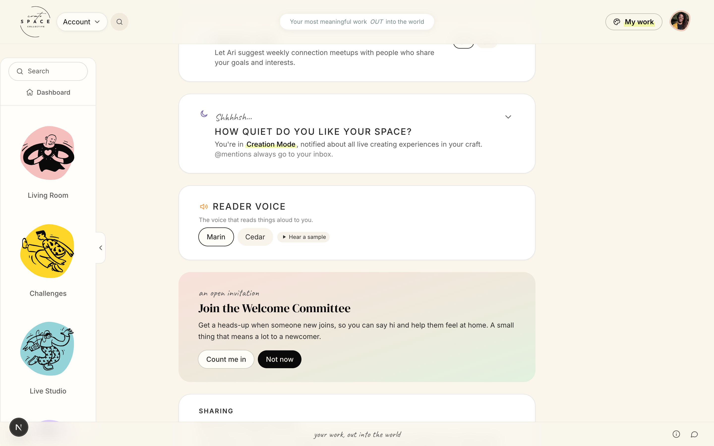
How quiet do you like your space? Notification modes, down to quiet. Mentions still reach you.
Match-ups, on or off. Weekly meetups suggested from shared goals, only if invited.
Reader voice. The voice that reads things aloud, with a sample to hear first.
Welcome Committee. Count me in, or not now. Greeting newcomers is opt-in.
Arrival
Stranger to first win
The recurring loop
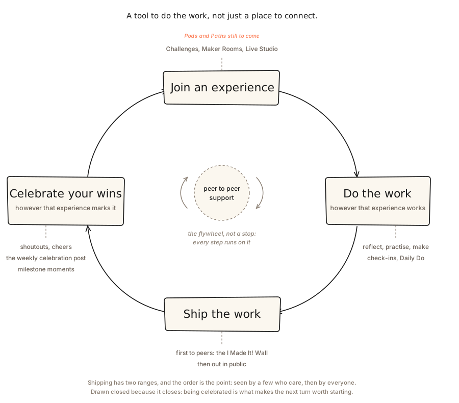
Support is the hub, not a step
Drawn as a step it would say support arrives once the work is done, which is the opposite of what the place is for.
Shipping has two ranges and the order is the argument: seen by a few who care, then by everyone.
Celebrating closes the turn. It is a state, not a page, so it is built into the end of each experience.
Reach
The public pitch
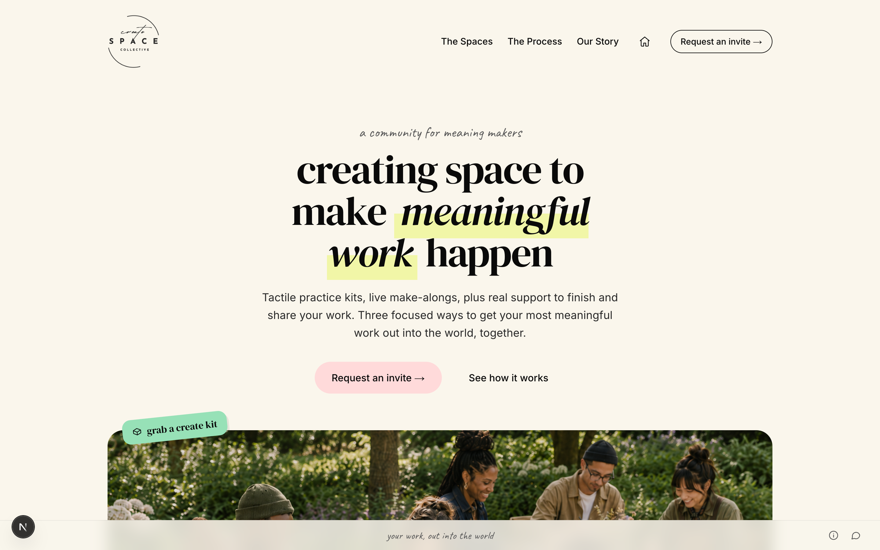
Outreach runs on live interactive letters and small events, published from Delivery, a multi-brand publisher built alongside this.
The letters are the loop run once, in public, for free: watch, make something, write back. The outreach is a sample of the product rather than an advert for it.
First Run
Welcomed by a person, not a tour
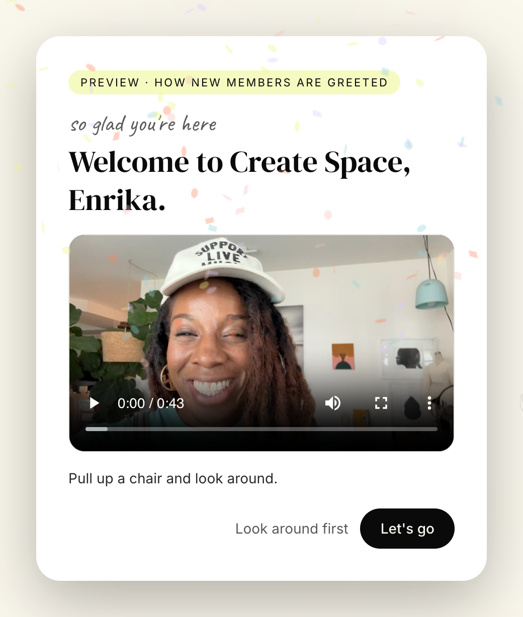
Opening it also asks the welcome committee to say hi: existing members are notified to greet the newcomer, matched on shared profile signal.
Shown in the built-in admin preview, which lets a host re-run onboarding without consuming a member's first-run flag.
Home Base
Where a member starts
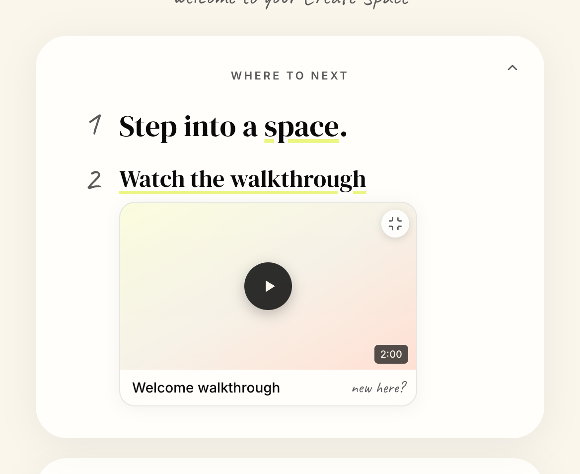
The dashboard greets you by name and offers a numbered Where to next: step into a space, watch the walkthrough, see what is happening.
The rooms rail runs down the left, hand-drawn, one icon per space, so the place reads as a floor plan rather than as navigation.
Hold this slide in mind. What it offers is the subject of the finding.
The loop, in the product
A weekly rhythm and a place to join
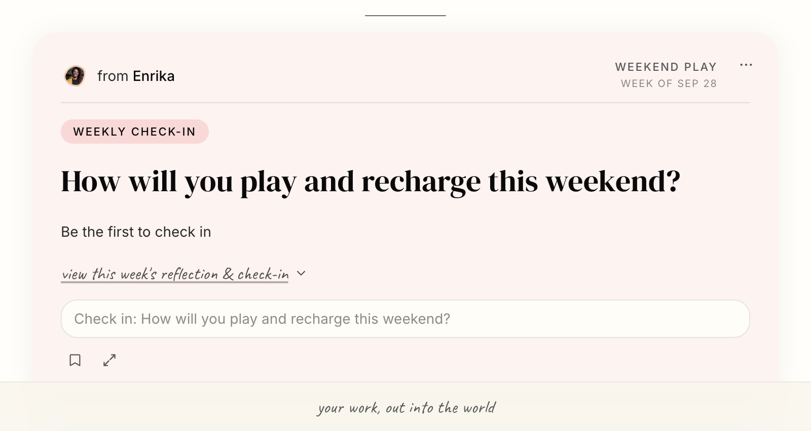
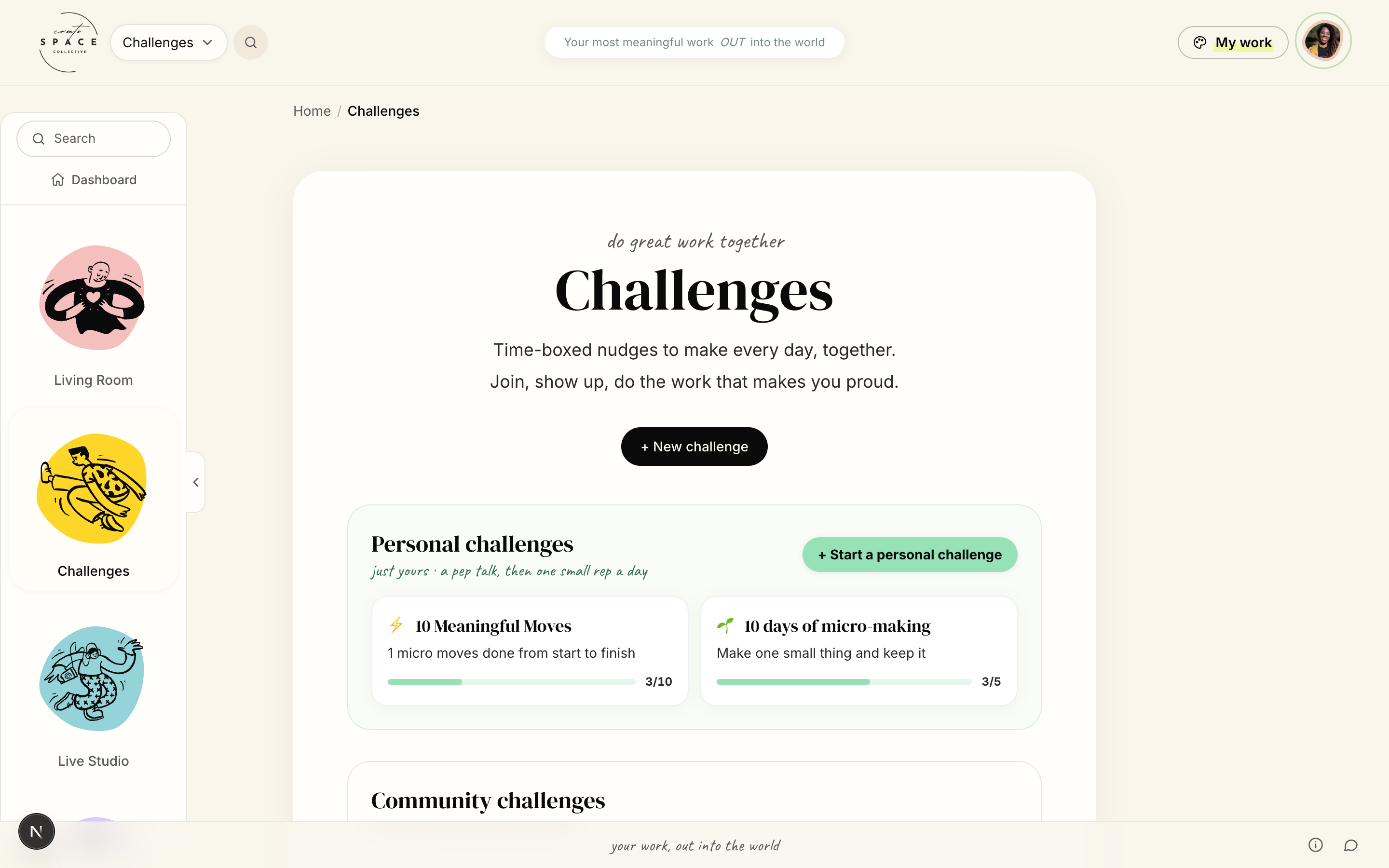
Personal challenges are described in the app as just yours, a pep talk then one small rep a day. That framing is the First Win shaped correctly, and it sits five steps into the loop.
The detail the whole loop runs on
Feedback, on every surface
Support is the hub of the loop, so it cannot live in a comment box at the bottom of a page. Feedback attaches to the thing itself: a phrase, a frame, a point in a picture.
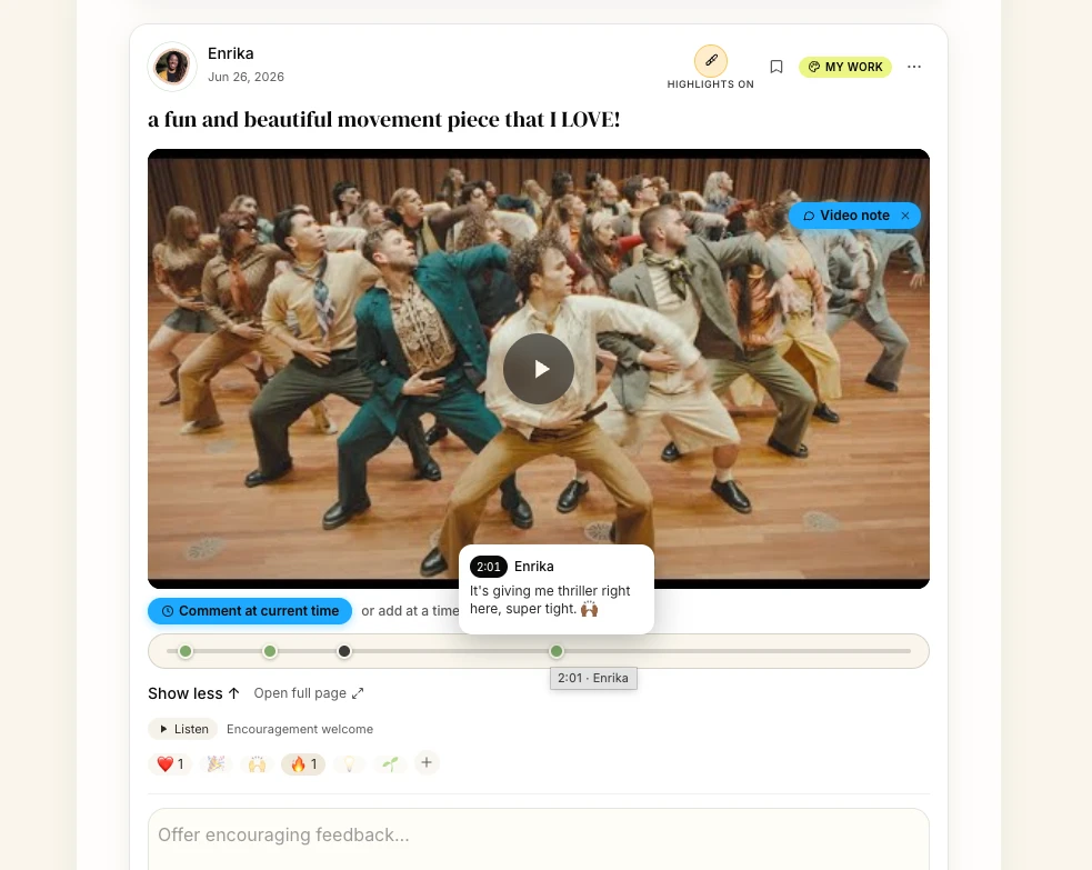
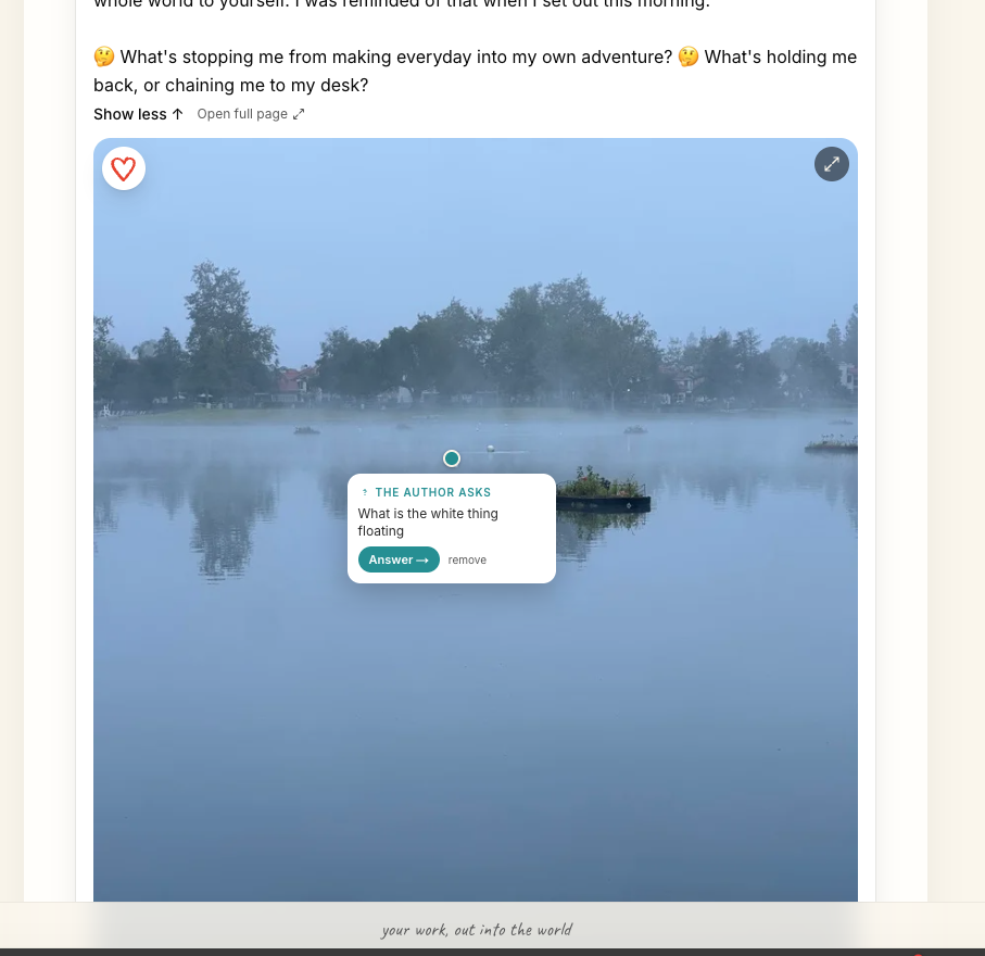
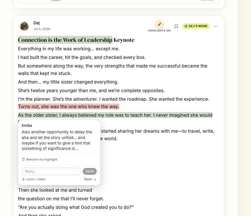
Click any of these to read them properly. Built as one feedback layer rather than three features, so a new surface inherits it instead of reimplementing it.
Both directions
Rich media on all inputs and outputs
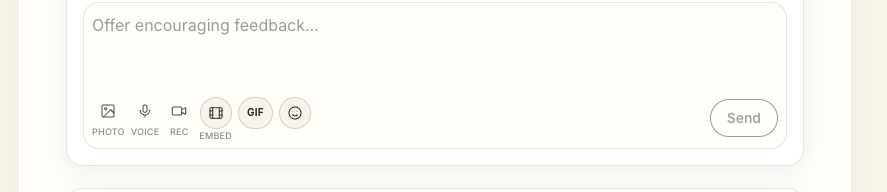
Rich going in. It asks you to offer encouraging feedback, then gives you more than text to do it with.
Rich coming out. Any post plays back as speech, in a reader voice the member picks. Media plays inline, highlights toggle off to read clean.
Consent before critique
Feedback has a dial, and a summary
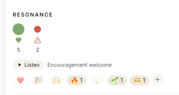
The maker sets the level first. Encouragement welcome tells the room what kind of response is wanted before anyone replies. That is what makes honest critique possible later.
Resonance aggregates the answer. A maker sees the shape of the response without opening every reply.
The granular layer tells you what one person thought of one phrase. This tells you what the room thought of the whole thing.
What the mapping found
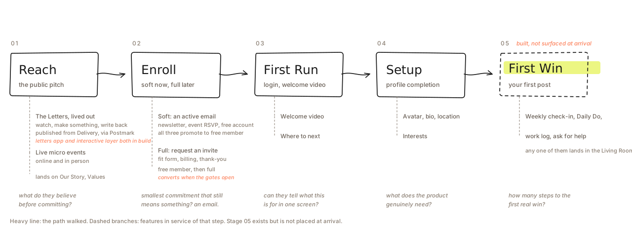
The product had no First Win placed at arrival
Every option on the dashboard was orientation. The thing the landing page promises in its first sentence was four clicks away.
The fix turned out to be placement, not capability. Every door into a first post already worked: weekly check-in, Daily Do, work log, ask for help. All of them already land in the Living Room.
Ask for help counting as a first win is the deliberate part: someone stuck with nothing made yet, which is often why they joined, can still cross the line on day one.
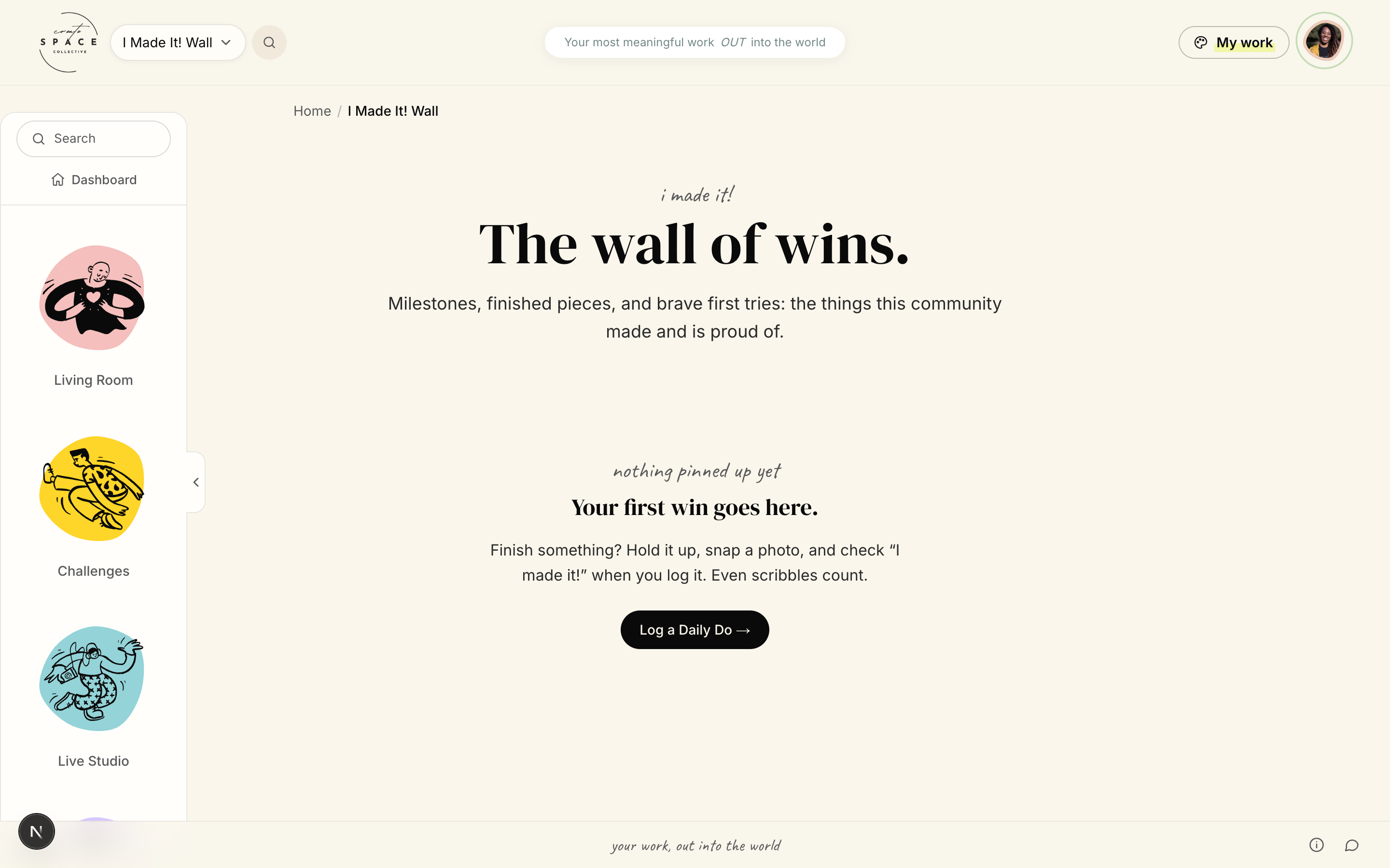
Naming the gap correctly changed the size of the work by an order of magnitude. Nothing to build, something to move.
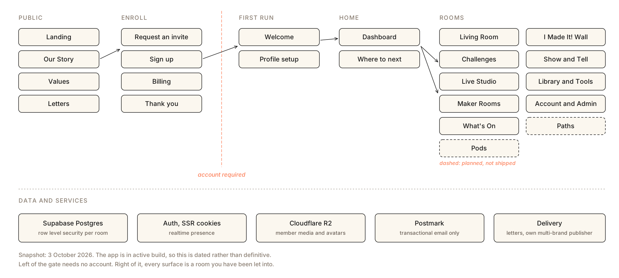
Architecture · as of 3 October 2026
A door, then rooms